The Art of Warhammer
Hello and welcome back to another weekly blog post. I know that I’ve already done a lot of posts on continuity and change and Warhammer, but something I wanted to do is look at how the artwork for Warhammer 40K has changed over the years. And like I’ve talked about in previous posts, artwork is actually a pretty big part of Warhammer, because it reinforces that important aspect of the story. And like I’ve said before, the introduction of the story aspect of miniature wargaming has become an important part of the hobby. So without further ado, lets get right into it.
The first edition of Warhammer 40,000 was actually called Rogue Trader, and as I’ve talked about before, it was a far cry from modern day Warhammer. So, it should come as no surprise that the artwork was too.
As you can see, they are certainly interesting to say the least. The art style uses shadows a lot and has a weird, but unique, vibe to it. Also, the majority of artwork at the time was just black and white, with the coloured images being reserved for the covers of the books. The coloured one I included was actually the cover of the core rulebook.
When the 2nd edition of the game came around, it was renamed to Warhammer 40,000 and some big changes were made to the game, including the artwork.
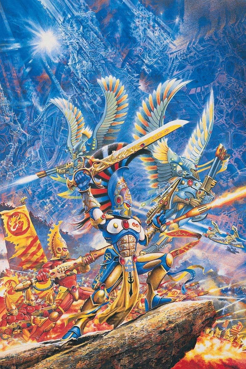
Almost all of the art is coloured now, and the colours themselves are more vibrant than the few coloured pieces prior. There is also now a larger sense of scale to the artwork, with huge armies being presented, usually with a central character in the foreground. The massive, monolithic structures in the background help establish this as well.
3rd edition saw perhaps the biggest change to the story, the switch to a more “grimdark” setting. You can see the artwork beginning to reflect this, and it also gets more detailed and realistic.
Interestingly, they was actually went back to some black and white artwork, although there is still plenty of coloured ones as well. And since this era is what established Warhammer 40,000 as a setting, not much really changes in terms of the actual content of the artwork. However, the style and quality does change, so I will show artwork from 4th to 9th edition.
As you just saw, modern Warhammer art is incredibly detailed, and all of it is coloured now. It’s had a lot of changes since the days of Rogue Trader, from tone, to setting, to pretty much everything else. However, some things have stayed the same, like how it continues to use the same scale from 2nd edition, and the grimdark feel from 3rd edition. I’d also like to add that this is just the official artwork, there are tons of talented fans making artwork of their own that are worth checking out. But anyways, that’s about it for this blog post, so remember to stay tuned.


